
I’ve already featured a series of postcards that used a colourisation process to add colour to black and white photos.
There are several colourised photos in my postcard collection and I’ve attempted to recreate the process using modern digital tools.
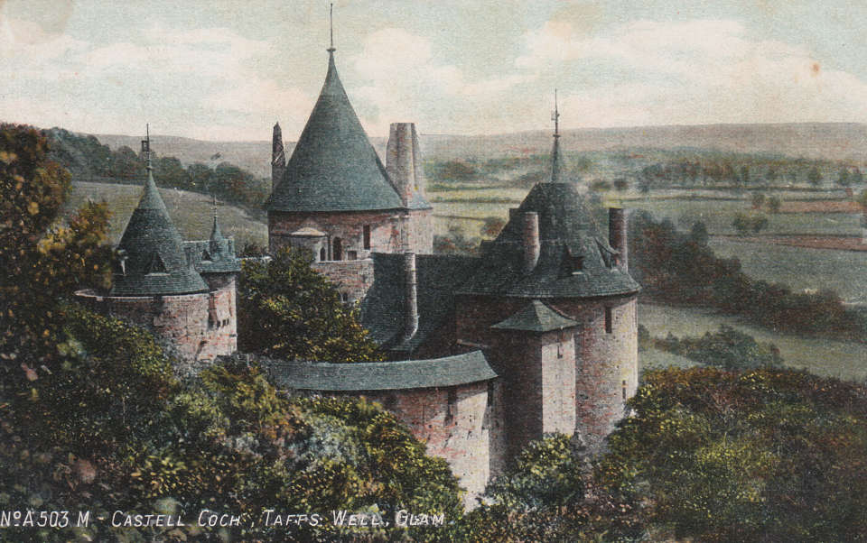
Red or Blue?
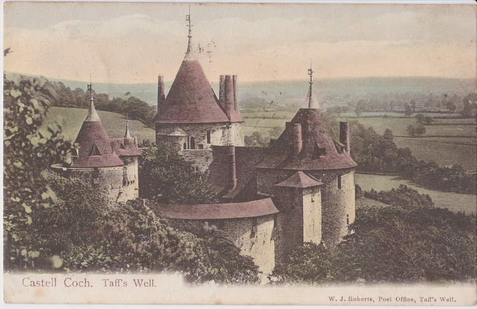
These cards are a perfect example of how colourisation produces very different results. The most obvious difference being the colour of the roof! The top image looks more detailed but the colours are quite muted.
The bottom image has less detail in the scenery, which looks more like a painting than a photo. However, the colours are more vibrant and extra detail appears to have been added to the trees in the foreground.
I featured the top card back in 2019 on Tongwynlais.com.
Before and After

The colourisation of this photo looks very primitive compared to the first example. It appears that a limited number of colours were available in the process.
The result is mixed. Ynys House looks good but the other buildings are just a muddy brown. Castell Coch seems to have lost detail and looks far worse. I’m not sure what the large brown area is.
The addition of colour makes the image look more like a painting and sacrifices detail.

A similar view is featured on another postcard produced by Ernest T Bush. This photo shows far more detail.
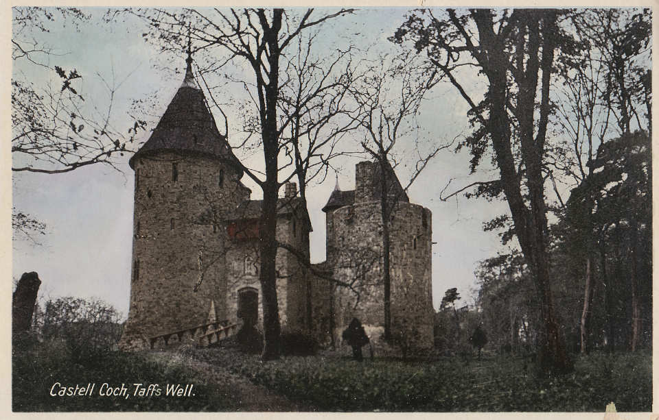
My Attempt

I investigated this postcard last year and think it’s from 1930-1950. I wanted to try and add some colour while retaining the feel of the original and without making it look fake.
The colours I’ve added are very muted and I haven’t tried to add any details. I think this still looks like an image taken 80 years ago.


Good job, Jack!
Combing your interest in history and your digital skills is a great idea – fascinating variation in the results – thanks for sharing your experiments.